Showing posts with label images. Show all posts

Thursday, October 16, 2014

Best Practices for Adding Images in Custom Tabs

As you customize your mobile app with unique content via custom tabs, adding images is a great way enhance the content so that your users have a more visually dynamic experience beyond reading a block of text.
An example from Silk Road Rising of how adding an image can enhance a custom tab.
Lets take a look at some best practices for embedding images effectively in custom tabs.

Where to Host Images

First, you need to decide where to host the images. There are a few options available to you.

Your Own Server: If you already have a dedicated server for your main website that you have easy access to, this would be a convenient place to host the images.

Third Party Server: Services like Photobucket and ImageShack offer reliable alternatives.

InstantEncore File Storage: However, we highly recommend hosting images directly on InstantEncore. Under the "Extras" menu in the Control Panel you will find a "File Storage" tool that gives you a quick and easy way to upload images you wish to embed.


Just select the desired file from your computer, provide a simple description and click "Upload".


We provide you with a convenient link to your image which you can copy and use to embed that image in your custom tab.


The major advantage of hosting your images directly on InstantEncore is that, if your website or third party server were to ever experience downtime, those image links would be broken in the App until that server came back online. Hosting your images in our File Storage area ensures that the images in your Custom Tabs will be visible whenever someone is using your App.

How to Embed Images

You can embed images in either the Design or HTML modes of the custom content editor.

Design Mode: The "Design" mode is the default mode when editing a custom tab, and a common way to make quick and easy edits to your custom content. Embedding an image is easy! First copy the URL of your image from our File Storage area (or from your own server or a third party service).

In the custom tab editor, click the icon in the toolbar that looks like a small picture.


Then paste the URL where it asks for the "Image Source". Click on "OK" and your Image will show up in the editor.


Some helpful tips for formatting images with this tool:
  • Depending on the background of your app, you may wish to set a Border Thickness of 2 to 3 pixels to provide some contrast between it and the embedded image.
  • Adding 5 to 10 pixels of Spacing keeps text from pressing right up against the image.
  • While you can set a specific width and height for your image here, with a mobile design in mind you may want to consider using HTML mode and CSS to achieve the most power and control over your custom content with percentage based sizing.

HTML Mode: Working in the "HTML" mode gives you much finer control over your custom content. To add an image in this mode, type <img src="IMAGE URL"> and paste the URL between the quotes.


Our example image is fairly large to accommodate larger screen sizes. This is important as we want to use large images that we can scale down, instead of small images that would look bad when scaled up. So in the preview it will look like this:


Using CSS to Fit Images

By itself, the image is very wide and goes beyond the viewing area of the app, causing the tab to do what we call "free-scrolling" where the user can scroll up, down, left, and right with their finger in order to see all of the content. You'll notice I've also added some sample text at this point to make this feel like a real custom tab.


For usability, in most cases we want to limit scrolling to just up and down, but as your app will be used on devices with different sized screens, we also want to make sure that this content will scale to those different sizes.

Lets explore what CSS can do for us and also take a look at another feature, the "Custom CSS" tool in the "Styles" area of the Mobile App Control Panel.


This tool lets you set custom styles that will be applied to the app. Because we don't want these styles to be applied to everything in the app, just our images, we first need to use a class selector when adding images to the custom tabs. This lets us set CSS for several images without having to type out the code over and over, which makes changes and updates effortless. If you want to have some images take on one style and other images take on a different style, just create a different class for each set.

The HTML for the images in the custom tabs will look something like:

<img class="custom_class" src="IMAGE URL">


And the CSS in the Custom CSS tool will look like:

img.custom_class {
CSS CODE;
}


The .custom_class can be any unique keyword you like and should reflect what the class is being used for. Examples might be .banner, .mapImage, .artist_photos, etc. Specifying img will make sure that other elements that might be assigned the same class aren't affected as well. This may not be needed in your case, but it is a good practice to observe.

height: In all cases, we want to set the height property to height: auto; to make sure that the image will scale with the width and preserve the aspect ratio of the image.

width: Setting the width property to 100% means that the image will take up 100% of the width of its container (not including other margins or padding that may be set by the app). This is good if you want an image to act as a banner that always stretches across the entire screen.

img.custom_class {
height: auto;
width: 100%;
}


One thing to be mindful of is that this can cause an image to scale beyond its original size and lead to reduced image quality, which is why I prefer to use the next option, max-width.

max-width: The max-width property will define the maximum width the image can be. When set as a percentage, this will cause it to scale with its container until it reaches the actual size of the image.

img.custom_class {
height: auto;
max-width: 100%;
}


You'll notice that in this example, the first image looks the same as before, however in the wider example, the image does not continue to grow with the app as it has reached its actual size. This makes the property useful for photos or other situations where strict formatting is not important, but you still want it to scale within reason and without sacrificing quality.

min-width: Very rarely will you want to use the min-width property, but there are occasions. If you find yourself in a position where you need to embed an image with small text or a map with detailed information, you may wish to prevent the image from becoming too small, but still have it scale at larger sizes.

The image will display at normal size unless the container becomes wider than the actual image size, in which case it will start to scale according to what percentage is set.

img.custom_class {
height: auto;
min-width: 100%;
}


Notice that I have included some "fine print" in our example image to help illustrate this point. While we want to avoid "free-scrolling" when possible, ensuring that text content in the image is readable is also a valid concern, and min-width can be used for these instances.


What Else Can We Do?

Play around with the percentages. Set the max-width at 80% instead of 100% to include more white space or a width of 50% to leave room for text next to the image. You might need some other CSS and HTML tools to help get the formatting just right though.

I've linked several times already to w3schools - an outstanding resource for HTML, CSS, and more. It lets you experiment directly on their website before bringing what you've learned into your mobile app.

If you have any questions or run into challenges, email us at support@instantencore.com.

Wednesday, June 27, 2012

Social Media and Your Mobile App, Pt 1 - Feeding Content into Your Buzz

The Buzz area of the InstantEncore control panel provides dynamic content for your mobile app - in the What's New section of the home page as well as its own separate Buzz tab.  Many artists and arts organizations publish fresh content online through social media platforms and social networks.  So how can you bring this fresh content into your app's Buzz area?

The Buzz area automatically brings your content into the mobile suite by synchronizing with your content's RSS and Atom feeds.  The best way to automatically pull your social media and social networking content into your mobile app is to identify the RSS feed for your account and add it to the Buzz area.


Finding your content's RSS or Atom feed 

  • Blog or Podcast - Most blog and podcast platforms provide you with an RSS address so that your followers can subscribe to your content.  If you are not sure what your feed address is for your blog or podcast, conduct a search within the platform's FAQs or in its forum area.
  • Facebook - UPDATE: As of June 2015, Facebook no longer provides RSS or XML feeds for sharing content with web services. Click here for information on how to add Facebook content to your app.
  • Twitter - UPDATE: As of June 2013, Twitter no longer provides RSS or XML feeds for sharing content with web services.  Click here for information on how to add Twitter content to your app.
  • MySpace - MySpace provides you with the ability to grab the RSS feed for your MySpace blog.
    • On your profile page, click on "View All Blog Entries." 
    • In the top right-hand area of the next page, there are a few text links, one of them says "rss". 
    • Click on that link and the RSS feed address for your MySpace blog will appear in the web address bar.
  • Google+ - Here is the workaround for Google+.
    • Find your Google+ ID number by going to your Google+ profile page.  The number is located in the URL address between 0/ and /posts.  For example:
      https://plus.google.com/u/0/117336246664676002690/posts
    • Copy your ID number
    • Add it to the end of this sequence:
      http://plu.sr/feed.php?plusr=YourGoogle+IDHere
  • Tumblr - Tumblr definitely has the easiest RSS feeds to find.  Use http://YourTumblrBlog.tumblr.com/rss
  • Flickr - This one is pretty easy, too.  
    • Go to your Flickr photostream page and scroll to the bottom.
    • Where it says "Subscribe to YOUR photostream," click on the link next to it labeled "Latest"
    • The RSS feed address for your photostream will appear in the web address bar.
  • Pinterest - For Pinterest, the RSS feed will depend on whether you want the feed for your account or for a particular pinboard.
    • The RSS feed for your account will be http://pinterest.com/YourScreenName/feed.rss
    • The RSS feed for a particular pinboard will be http://pinterest.com/YourScreenName/YourBoardName.rss

Adding a feed to your Buzz

  1. Once you have located the feed for content, go the Buzz area of the control panel.
  2. Select Feeds in the submenu.
  3. Enter the RSS or Atom feed address in the empty text field.
  4. Select if the feed falls into the Blog, Podcast, or News category.
  5. Click on Add Feed.
  6. Once you have added your feed, be sure to click on Edit Image and upload a 75px X 75px graphic to  associate with the feed.  (We recommend PNG or GIF image files.)  Whenever content from the feed appears in your Buzz tab or on your Home tab, this graphic will appear in the list as a visual indicator of the source.
And you're done!  Now, you have dynamic content automatically feeding into the Buzz tab and the What's New area of the Home tab of your mobile app from your social media account.

Something to Consider 

Take a moment to think about your social media behavior.  If you frequently repost items from one social media source to another, then you may not want to add both feeds to your Buzz.  This would create redundant content entries.

So, if you automatically pull your Twitter posts into your Facebook wall posts, then perhaps you just want to select one of those social media accounts to feed into the Buzz area.

In our next post, we will look at two other ways of bringing your social media content into your mobile app.

Thursday, May 10, 2012

Connecting QR Codes to Tabs in Your Mobile App

QR codes are two-dimensional images that can be linked to online content. The image is scanned using a smartphone's camera, and the mobile user is taken directly to the content.

In this video, we walk through the process for connecting content from your InstantEncore mobile app with QR codes. The codes can be included in a variety of print publications: season brochures, postcards, posters, print ads, business cards, and more.


Expand the video to full screen for optimal viewing.

For tips on ways to use QR codes, check out these resources:

Monday, March 12, 2012

Branding Your Mobile App with Graphics

According to the American Marketing Association, a brand is "a name, term, sign, symbol or design, or a combination of them intended to identify the goods and services of one seller or group of sellers and to differentiate them from those of other sellers."  So how are performing artists and arts organizations using graphic elements within their mobile apps to identify and differentiate themselves from other artists and arts organizations?

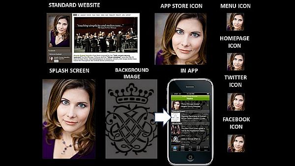
Mezzo-soprano Angela Young Smucker IS her brand.


VISAGE: For individual artists and ensembles, they are the brand.  Correspondingly, the brand is typically connected directly to their visage.  In the example above, mezzo-soprano Angela Young Smucker uses her headshot as a primary tool for building her brand recognition.

You'll notice that she uses a singular image as a graphical branding tool - for every icon, for every platform.  The constant and consistent use of this image provides for a strong fortification of her visual brand online and on mobile devices.

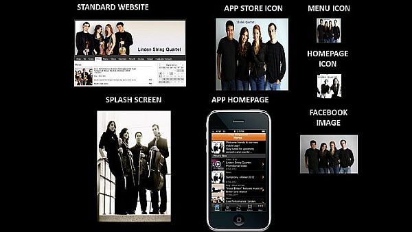
Linden String Quartet uses various images of the group members to strengthen their brand.


The use of multiple visage-focused graphics can also reinforce an artist or ensemble's visual brand.  In the example above, Linden String Quartet uses multiple images of the quartet members to fortify their brand.  In some of the images, they hold their instruments which plays more strongly on the musical nature of the brand.  Other images feature the ensemble in jeans and t-shirts which highlights their accessibility.

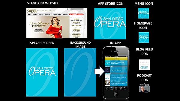
San Diego Opera builds its visual brand around the typographical design for the "O" in opera. 


LOGO:  Perhaps, the most common visual branding element for organizations is their logo, which may be an image, text, or a combination of the two.  For example, San Diego Opera has a primarily textual logo with the sole graphical departure being the "O" in opera, which has a different slant and font than the rest of the text.  While they often use the entire logo to brand the organization, a predominant emphasis is placed on the "O" for building brand recognition.  Even in the smaller icons for their mobile app, the signature "O" is the piece of the logo that remains the most recognizable.

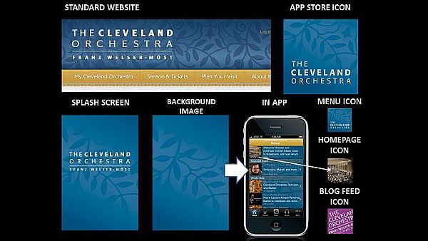
The Cleveland Orchestra uses a seemingly unrelated graphical element -- branches with leaves --
as the primary tool for visually branding the organization within its mobile app.


Sometimes the logo shows a direct relationship to the organization, as in the case of the San Diego Opera.  Other times, the logo pushes the viewer to make their own connections between the graphic and the organization.  If we look at The Cleveland Orchestra, we can see that they consistently use a silhouetted branch pattern in their visual branding.  As there is nothing particular about this branch pattern that connects directly to orchestral music or the city of Cleveland, viewers must create the relationship for themselves.  Interestingly enough, the consistent and repeated use of the graphic insists to the viewer that there IS a connection -- we just have to figure out what it is.

Okay, so what about their Homepage Icon?  This icon appears in the Welcome message area at the top of the Home page.  It also serves as the default icon for any content in the mobile which does not have an image associated with it.  In this case, The Cleveland Orchestra was already using their graphic and color (see next section) in the Background Image for the app - so they needed to use another image as the Home page so that the icon did not get lost.  They decided to use an image of the stage from the audience's point-of-view.  This is a great way of subtly reinforcing the app user's relationship to a live performance's audience.  Bravo!


COLOR:  As noted above The Cleveland Orchestra carries the colors established on its standard website into its mobile app as a branding element.  Another example of how color may be used for branding within the mobile app is Pacific Symphony.  Let's analyze the collage above from top left across and down to bottom right.

Pacific Symphony starts pulling color from their standard website into the header for their Tumblr blog along with the graphical and textual elements of their logo.  Then, they pull the color into a gradiated background for the app store icon which also features the logo's text in white as well as a silhouetted version of the logo's graphic.  This reappears in both the Menu Icon and the Homepage Icon.

They choose a lighter version of the background color and graphic silhouette for the app's Splash Screen, then they exchange the background color for a complimentary one in the Background Image.  Why?  With the Homepage Icon pulling the same color and graphic presentation as the App Store Icon and Menu Icon, they need a strong contrasting color that would allow them to continue to use the graphic element within the Background Image without it being too much for the eye.  It also provided them with another color that could be used in Blog Feed Icon to further differentiate where the content in the app is coming from while maintaining the organization's visual brand.

So as you build your online and mobile presence, consider your visual brand every step of the way.   What must stay consistent and where can you benefit from variation?  If you can master that, then your fans will always recognize your brand - wherever they may see it.