
 |
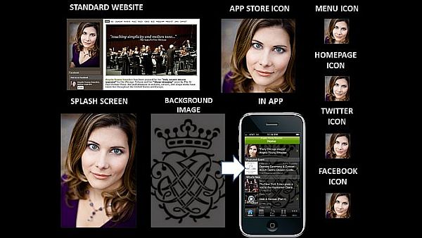
| Mezzo-soprano Angela Young Smucker IS her brand. |
You'll notice that she uses a singular image as a graphical branding tool - for every icon, for every platform. The constant and consistent use of this image provides for a strong fortification of her visual brand online and on mobile devices.
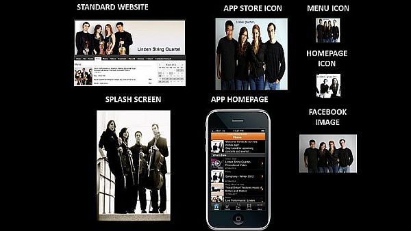 |
| Linden String Quartet uses various images of the group members to strengthen their brand. |
The use of multiple visage-focused graphics can also reinforce an artist or ensemble's visual brand. In the example above, Linden String Quartet uses multiple images of the quartet members to fortify their brand. In some of the images, they hold their instruments which plays more strongly on the musical nature of the brand. Other images feature the ensemble in jeans and t-shirts which highlights their accessibility.
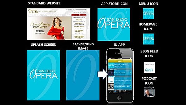 |
| San Diego Opera builds its visual brand around the typographical design for the "O" in opera. |
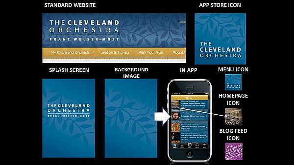 |
| The Cleveland Orchestra uses a seemingly unrelated graphical element -- branches with leaves -- as the primary tool for visually branding the organization within its mobile app. |
Okay, so what about their Homepage Icon? This icon appears in the Welcome message area at the top of the Home page. It also serves as the default icon for any content in the mobile which does not have an image associated with it. In this case, The Cleveland Orchestra was already using their graphic and color (see next section) in the Background Image for the app - so they needed to use another image as the Home page so that the icon did not get lost. They decided to use an image of the stage from the audience's point-of-view. This is a great way of subtly reinforcing the app user's relationship to a live performance's audience. Bravo!

COLOR: As noted above The Cleveland Orchestra carries the colors established on its standard website into its mobile app as a branding element. Another example of how color may be used for branding within the mobile app is Pacific Symphony. Let's analyze the collage above from top left across and down to bottom right.
Pacific Symphony starts pulling color from their standard website into the header for their Tumblr blog along with the graphical and textual elements of their logo. Then, they pull the color into a gradiated background for the app store icon which also features the logo's text in white as well as a silhouetted version of the logo's graphic. This reappears in both the Menu Icon and the Homepage Icon.
They choose a lighter version of the background color and graphic silhouette for the app's Splash Screen, then they exchange the background color for a complimentary one in the Background Image. Why? With the Homepage Icon pulling the same color and graphic presentation as the App Store Icon and Menu Icon, they need a strong contrasting color that would allow them to continue to use the graphic element within the Background Image without it being too much for the eye. It also provided them with another color that could be used in Blog Feed Icon to further differentiate where the content in the app is coming from while maintaining the organization's visual brand.
So as you build your online and mobile presence, consider your visual brand every step of the way. What must stay consistent and where can you benefit from variation? If you can master that, then your fans will always recognize your brand - wherever they may see it.
2 comments:
Fun fact... the pattern on the Cleveland Orchestra app is actually from Mrs. Severance's wedding dress (as in Severance Hall, where the orchestra plays).
From their website:
"The lotus flower pattern of Severance Hall’s gleaming silver ceiling was inspired by the wedding dress of Elisabeth Severance, whose husband, John, built Severance Hall in her honor. What better place for your own special day? Call 216-231-7421 or email us for information."
http://www.clevelandorchestra.com/rental.aspx
Post a Comment