Kickstarter has rapidly become one of the most important new sources of funding for Artists and Arts Organizations. Overall, Kickstarter has had over $150 million pledged to help fund projects already, and they are only growing. Crowd-sourcing your funding is also a solid way to help grow your Fan base by giving those who could never sponsor an entire event or recording on their own a chance to be a part of the process. You can create a stronger connection with them as more than just audience members, but as Partners. With that it mind, it only makes sense to look for the best ways to integrate Kickstarter into your own InstantEncore powered services.
Website
Available to both Free and Pro accounts for Artists and Ensembles, your Website is your home on the internet. While it is of paramount importance to promote direct links to your Kickstarter page via social media such as Facebook and Twitter, no Kickstarter campaign would be complete without the information displayed prominently on your Website as well. New Fans will likely find you by your Website first, so letting them know that they can participate in your organization from the very start is key.
First, you will want to go to your Kickstarter's project page, find the "< > EMBED" button next to the other social media links, and click it to open the widget page.
Copy (Ctrl/Command-C) the code that appears to your clip board. Once you have the embed code ready, go to your InstantEncore Website Control Panel and manage your Sidebar settings.
At the bottom will be an option to "Add Widget/HTML". Give the Label a unique title, paste (Ctrl/Command-V) the code into the HTML area and click "Create".
You can use the orange arrows to change the order of where items appear on your Website. The higher up you place the Kickstarter widget, the more noticeable it will be. The widget will also automatically update each time it is viewed, showing your progress. Your finished product should look something like this...
Sidebar items appear on every page of your Website for maximum visibility - whether Fans are looking at Events or listening to Music, they will always be aware that they can be your Partner instead of just a passive Fan. For added visibility, you can manage your Website's Home page and add an announcement about it as well, as above.
Rewards
Promoting your Kickstarter project is only half of the battle. Creating compelling rewards levels will be the deciding factor for not only IF people will help, but by how MUCH. This is another step in which integrating your InstantEncore services can help seal the deal.
An extremely effective low level reward is to offer some of your music as a free download. Simply create a Download Code Campaign in your Control Panel, create either a single universal code or several personalized codes, and send a code to each Backer who helped fund at that level.
Higher level rewards usually combine low level ones with other exciting incentives such as autographed materials or special recognition. Why not take it one step further and add the highest Backer as a Sponsor on InstantEncore? This option is available when managing an Event or Music Album options, or use your imagination with any of the custom content areas on your Website!
Mobile Apps
Stay tuned...!
Tuesday, March 27, 2012
Monday, March 12, 2012
Branding Your Mobile App with Graphics
According to the American Marketing Association, a brand is "a name, term, sign, symbol or design, or a combination of them intended to identify the goods and services of one seller or group of sellers and to differentiate them from those of other sellers." So how are performing artists and arts organizations using graphic elements within their mobile apps to identify and differentiate themselves from other artists and arts organizations?
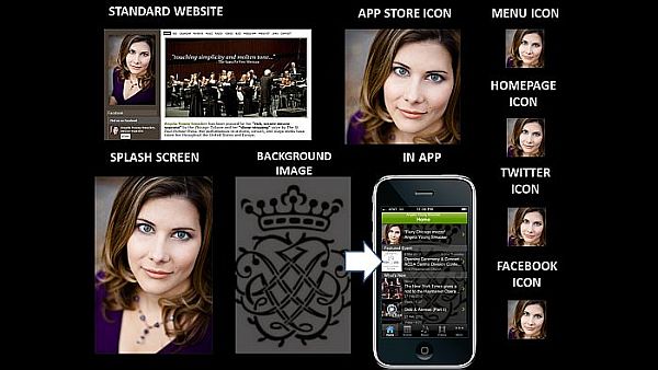
VISAGE: For individual artists and ensembles, they are the brand. Correspondingly, the brand is typically connected directly to their visage. In the example above, mezzo-soprano Angela Young Smucker uses her headshot as a primary tool for building her brand recognition.
You'll notice that she uses a singular image as a graphical branding tool - for every icon, for every platform. The constant and consistent use of this image provides for a strong fortification of her visual brand online and on mobile devices.
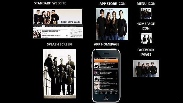
The use of multiple visage-focused graphics can also reinforce an artist or ensemble's visual brand. In the example above, Linden String Quartet uses multiple images of the quartet members to fortify their brand. In some of the images, they hold their instruments which plays more strongly on the musical nature of the brand. Other images feature the ensemble in jeans and t-shirts which highlights their accessibility.
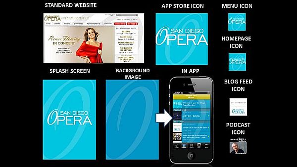
LOGO: Perhaps, the most common visual branding element for organizations is their logo, which may be an image, text, or a combination of the two. For example, San Diego Opera has a primarily textual logo with the sole graphical departure being the "O" in opera, which has a different slant and font than the rest of the text. While they often use the entire logo to brand the organization, a predominant emphasis is placed on the "O" for building brand recognition. Even in the smaller icons for their mobile app, the signature "O" is the piece of the logo that remains the most recognizable.
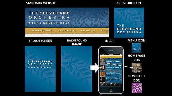
Sometimes the logo shows a direct relationship to the organization, as in the case of the San Diego Opera. Other times, the logo pushes the viewer to make their own connections between the graphic and the organization. If we look at The Cleveland Orchestra, we can see that they consistently use a silhouetted branch pattern in their visual branding. As there is nothing particular about this branch pattern that connects directly to orchestral music or the city of Cleveland, viewers must create the relationship for themselves. Interestingly enough, the consistent and repeated use of the graphic insists to the viewer that there IS a connection -- we just have to figure out what it is.
Okay, so what about their Homepage Icon? This icon appears in the Welcome message area at the top of the Home page. It also serves as the default icon for any content in the mobile which does not have an image associated with it. In this case, The Cleveland Orchestra was already using their graphic and color (see next section) in the Background Image for the app - so they needed to use another image as the Home page so that the icon did not get lost. They decided to use an image of the stage from the audience's point-of-view. This is a great way of subtly reinforcing the app user's relationship to a live performance's audience. Bravo!
 |
| Mezzo-soprano Angela Young Smucker IS her brand. |
You'll notice that she uses a singular image as a graphical branding tool - for every icon, for every platform. The constant and consistent use of this image provides for a strong fortification of her visual brand online and on mobile devices.
 |
| Linden String Quartet uses various images of the group members to strengthen their brand. |
The use of multiple visage-focused graphics can also reinforce an artist or ensemble's visual brand. In the example above, Linden String Quartet uses multiple images of the quartet members to fortify their brand. In some of the images, they hold their instruments which plays more strongly on the musical nature of the brand. Other images feature the ensemble in jeans and t-shirts which highlights their accessibility.
 |
| San Diego Opera builds its visual brand around the typographical design for the "O" in opera. |
 |
| The Cleveland Orchestra uses a seemingly unrelated graphical element -- branches with leaves -- as the primary tool for visually branding the organization within its mobile app. |
Okay, so what about their Homepage Icon? This icon appears in the Welcome message area at the top of the Home page. It also serves as the default icon for any content in the mobile which does not have an image associated with it. In this case, The Cleveland Orchestra was already using their graphic and color (see next section) in the Background Image for the app - so they needed to use another image as the Home page so that the icon did not get lost. They decided to use an image of the stage from the audience's point-of-view. This is a great way of subtly reinforcing the app user's relationship to a live performance's audience. Bravo!
COLOR: As noted above The Cleveland Orchestra carries the colors established on its standard website into its mobile app as a branding element. Another example of how color may be used for branding within the mobile app is Pacific Symphony. Let's analyze the collage above from top left across and down to bottom right.
Pacific Symphony starts pulling color from their standard website into the header for their Tumblr blog along with the graphical and textual elements of their logo. Then, they pull the color into a gradiated background for the app store icon which also features the logo's text in white as well as a silhouetted version of the logo's graphic. This reappears in both the Menu Icon and the Homepage Icon.
They choose a lighter version of the background color and graphic silhouette for the app's Splash Screen, then they exchange the background color for a complimentary one in the Background Image. Why? With the Homepage Icon pulling the same color and graphic presentation as the App Store Icon and Menu Icon, they need a strong contrasting color that would allow them to continue to use the graphic element within the Background Image without it being too much for the eye. It also provided them with another color that could be used in Blog Feed Icon to further differentiate where the content in the app is coming from while maintaining the organization's visual brand.
So as you build your online and mobile presence, consider your visual brand every step of the way. What must stay consistent and where can you benefit from variation? If you can master that, then your fans will always recognize your brand - wherever they may see it.
Labels:
app design,
branding,
color,
graphics,
images,
logos,
mobile apps,
mobile strategy,
website
Wednesday, March 7, 2012
What Could Your Performing Arts Organization Do With a Mobile App?
Expand the video to full screen for optimal viewing.
Subscribe to:
Comments (Atom)


